Last update: June 20, 2024
Never send image-only emails if you want an effective email marketing strategy. While it might be tempting to use visually appealing images to catch your audience’s attention, this approach can significantly hinder your email marketing efforts. Here’s why you shouldn’t send image-only emails and how to optimize your emails for better results.
Images are slow to load
One of the primary reasons to never send image-only emails is the slow loading time. Images are heavier than text, which can delay the loading of your emails. This is especially problematic for mobile users who often have limited bandwidth and longer loading times.
Solutions:
- Use smaller, optimized images for the web.
- Combine text with images to lighten the overall weight of the email.
- Use compressed image formats like JPEG or PNG to reduce file size.
Images are not displayed by default
In many email clients, images are disabled by default. This means that your image-only emails will appear as blank squares unless the user chooses to download them. At first glance, your email will look empty, which can discourage readers from opening it and engaging with the content.
Solutions:
- Always include text in your emails to convey essential information.
- Use alt tags to describe your images, which can help communicate the content even if the images are not loaded.
- Create a balance between text and images to ensure your message gets across even without the images being downloaded.
Images can display poorly on mobile devices
Displaying images in emails on mobile devices can be problematic. On iPhones, images are resized to fit the screen, which can make text within the images unreadable. On Android, large images can create scroll bars, making your message harder to read and less enjoyable.
Solutions:
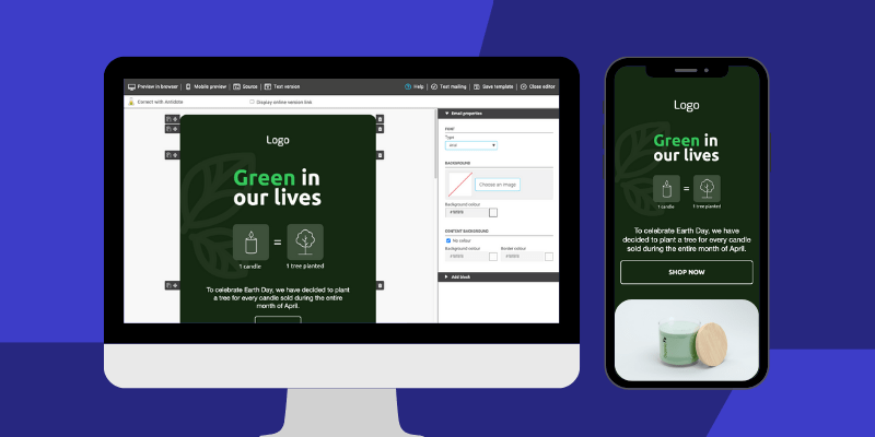
- Ensure you use responsive email templates, such as pre-drawn templates from Cyberimpact.
- Avoid including important text within images. Use HTML text for crucial information instead.
- Test your emails on different devices and email clients to ensure good presentation.

The receiving server might consider them spam
Another risk of image-only emails is that they can be perceived as spam. According to email service providers like Microsoft, this is a security issue for users. These servers cannot read the content of the images and may therefore decide to block your emails as a precaution. This negatively affects your deliverability rate and can damage your reputation in email marketing.
Solutions:
- Maintain a balanced text-to-image ratio to avoid being marked as spam.
- Use relevant and engaging text content to accompany your images.
- Ensure your images are hosted on a secure and reputable server.
Importance of balanced email design
To maximize the impact of your email marketing campaigns, it is essential to find a balance between text and images. Emails should be designed to convey your message clearly and effectively, even if the images are not displayed.
Best Practices:
- Use catchy headers and engaging text to capture attention right away.
- Integrate clear and clickable call-to-action (CTA) buttons.
- Ensure your emails are compatible with the most common email clients and optimized for mobile devices.
Pro Tip: Get inspired by the beautiful campaigns featured on ReallyGoodEmails.
Example of a balanced email: Imagine a promotional email for a new clothing collection. Instead of including only product images, you can:
- Start with a catchy text title: “Discover Our New Summer Collection!”
- Add a brief text description of the main items in the collection.
- Include product images with alt tags describing each item.
- End with a text CTA button: “Shop Now and Enjoy 20% Off!”
By following these tips, you can improve the deliverability and effectiveness of your emails, increasing engagement and conversions.
Learn here the 6 design errors to avoid on your email campaigns
Conclusion
Sending emails that are entirely composed of images might seem attractive, but this approach has several significant drawbacks. Slow-loading images, default display settings being off, mobile compatibility issues, and the risk of being marked as spam are all reasons to adopt a more balanced strategy. By incorporating relevant text and optimized images, you can improve the effectiveness of your email marketing campaigns and provide a better experience for your recipients.
In summary, while images can enhance the visual appeal of your emails, image-only emails come with many disadvantages. Understanding these challenges and adopting strategies to optimize your emails can improve the effectiveness of your email marketing and ensure that your messages reach their audience effectively and engagingly.
