On average, 90% of the people who visit your website won’t contact you and will never come back. You’ll never have the chance to start a discussion and develop a relationship with them. It’s a bit sad, but it’s reality.
That being said, if someone fills out a form on your website and subscribes to your newsletter, you can continue to communicate with this person (because they will receive your emails). And over time, this may lead to a sale or any other action that has value for you and your business.
Therefore, it’s important that your site invites people to sign up to receive your emails. To achieve that, people must see the invitation and must find it interesting and relevant.
Too often, we see websites that have a small form hidden at the bottom of the page with a generic mention such as “Subscribe to our newsletter”. This is not enough, you must do better!
Here are 5 real examples of effective registration forms…
1. Le Capitole (lecapitole.com)
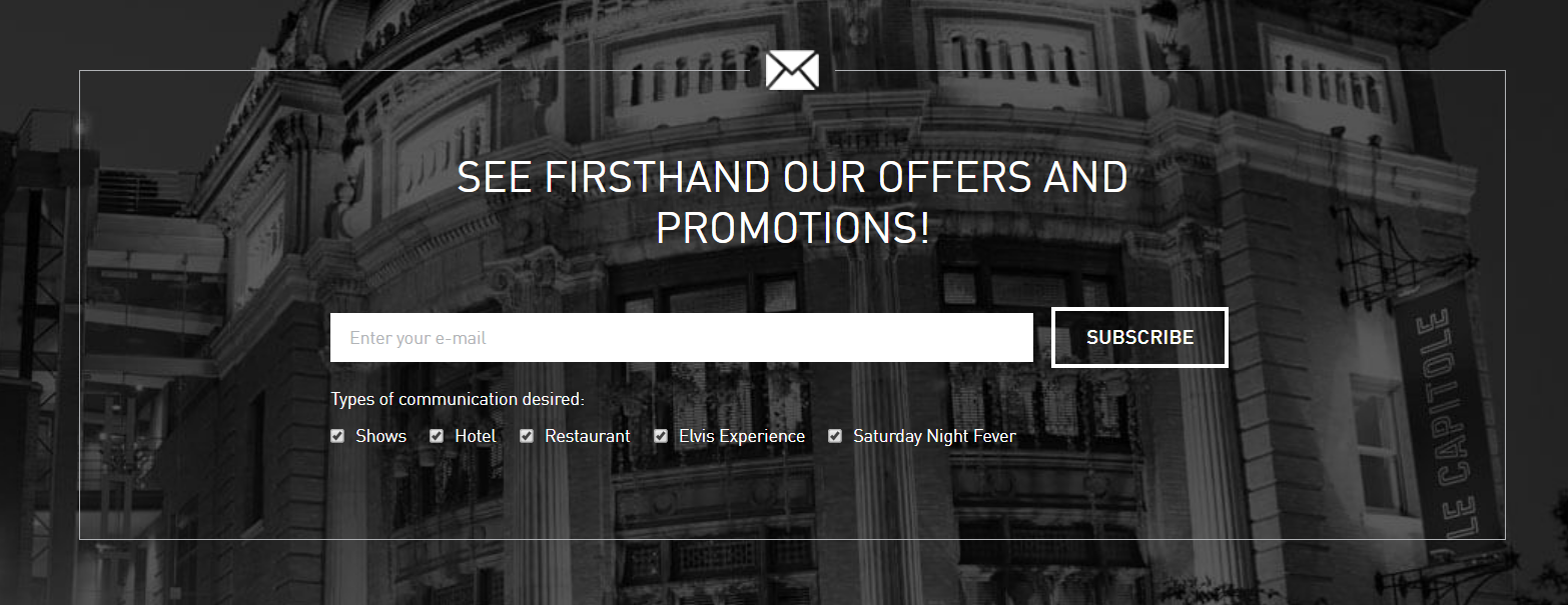
Le Capitol (a well-known hotel and venue in Quebec City) devotes a good part of its home page (the most visited page on any website) to the subscription to its newsletter. In addition to having a neat visual that can’t be missed, they have a clear offer; “see firsthand our offers and promotions”. It makes you want to register!
In addition, Le Capitol gives people the opportunity to customize the types of content they want to receive. It’s a great idea to make sure to send the most relevant content and offers to the right people.
2. Expo Yoga (expoyoga.ca)
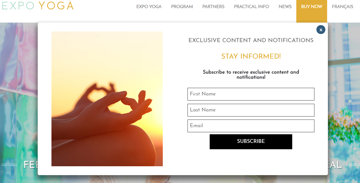
Sometimes it’s good to be proactive with our invitation. This is what Expo Yog does very well on its website. After being on the site for a few moments, the visitor will see a pop-up that invites them to register to receive exclusive content and notifications. If you’re passionate about yoga, chances are you’ll be interested!
3. Debbie Travis (tuscangetaway.com)
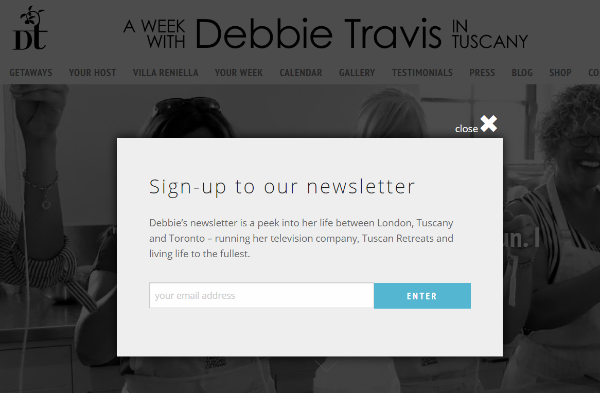
I’ll start by saying that I’m not a big fan of the headline “Sign-up to our newsletter”. It’s too generic. I would suggest something like “Peek into Debbie’s life”.
What I do like though, is the small paragraph below the headline. This bit of text lets you know what kind of content you’ll receive when you’re subscribed and does a good job at generating interest if you’re a fan. Debbie Davis seems to have a pretty cool life, sure, I want to know more!
4. Taylormade Leadership (taylormadeleadership.com)

I really like this subscription form. More specifically, I like the accompanying text. First, it uses social proof; thousands of people are subscribed, why not you too, don’t miss out! Second, it communicates the value you’ll receive as a subscriber; Randy’s free daily coaching and insights. They don’t call it a newsletter. Instead, they focus on what kind of information you’ll get once you’re subscribed.
If you ask me if I want to join your newsletter, I’ll probably say no. But if you ask me if I want to receive free coaching and insights, heck yea!
5. Canadian Internet Registration Authority (cira.ca)
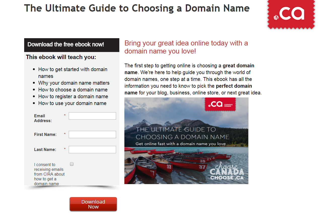
The Canadian Internet Registration Authority (CIRA) uses the oldest trick in the book to attract email subscribers; they offer a free ebook. But you know what, this tactic still works like a charm!
It turns out that giving away some valuable content in exchange for an email address is a very effective way to build your email list. It can be an ebook, a series of videos, etc. Think of what you can give away for free.
The CIRA also does an excellent job of asking for express consent by using a check box at the bottom of the form.
Bonus: Educatall (educatall.com)

I’m not a fan of the generic headline and call-to-action in this example. But there’s a little detail that I think is a great idea. Next to its headline, Educatall includes a link to the online version of their latest newsletter. That way, people can see a sample of what they’ll get before subscribing. People who subscribe after having seen an example of a newsletter know exactly what they sign up for and are likely to stay subscribed. I think this is a nice little hack worth trying.
Your turn now!
We hope these examples inspire you and give you some ideas. With a little work and creativity, you’ll be able to grab your website visitors’ attention and convince them to join your list.
Wishing you great success!
