Every business should have landing pages. They can make or break a sale by guiding your visitors to take specific actions that align with your marketing goals. A good landing page presents your business to your potential client with the sole focus of guiding them through the sales funnel.
By following these best practices and learning from successful examples, you can create pages that effectively convert site visitors into customers. This definitive guide will show you everything you need to know — types of pages, how to use them in your business, link them with your email marketing strategy, and create effective landing pages that drive results for your business.
What Are Landing Pages?
A landing page is a standalone web page designed for marketing or advertising campaigns. Unlike regular web pages, which may have multiple objectives, a landing page focuses on a single conversion goal, such as signing up for a newsletter, downloading an ebook, or buying.
Generally speaking, there are two Landing Page categories: Lead Generation and Click-Through.
Lead Generation
These pages are designed to capture user information, such as email addresses, through forms. They are often used for building email lists, hosting webinars, offering free trials, or distributing exclusive content.
Click-Through Landing Pages
Click-through landing pages provide information to warm up potential customers before directing them to another page, like a product or checkout page. These are commonly used in e-commerce to encourage visitors to explore more about a product before making a purchase.
What’s the Difference Between Landing Pages and Home Pages?
Unlike your homepage, which serves many purposes, landing pages are specifically designed to target a single goal. They give visitors a focused path to take action — making them indispensable tools for businesses.
Think of homepages as an entire slide presentation of your business. A landing page is a single slide with your product’s sales pitch. You can have multiple landing pages, each presenting a different product or presenting the same product for different audiences.
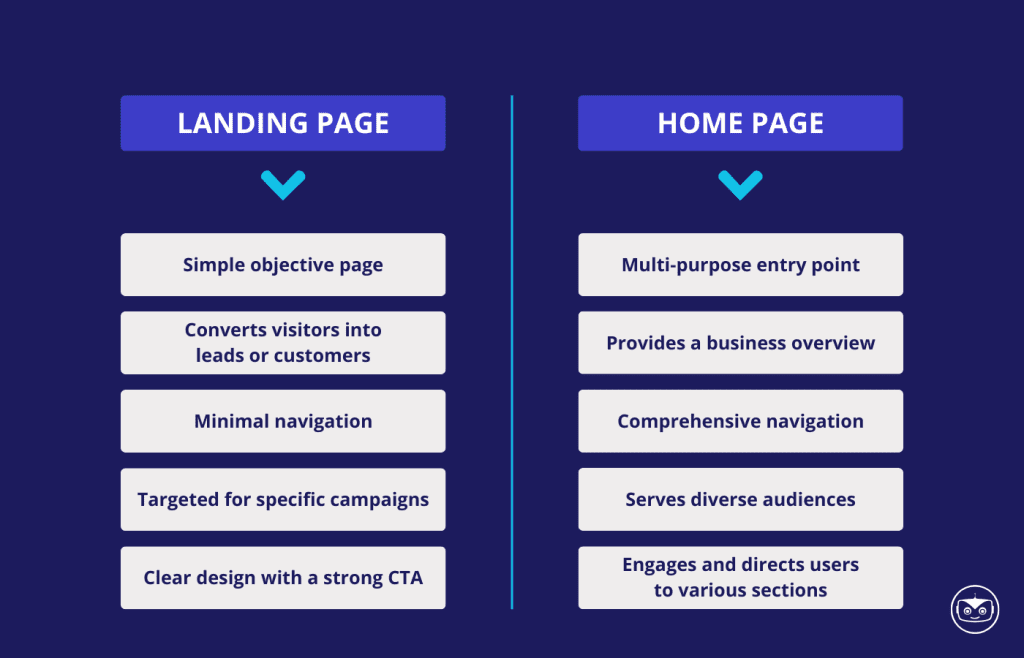
Learn the key differences between those two:
Landing Pages
- Focus on a single objective to minimize distraction.
- Designed to convert visitors into leads or customers.
- Contains minimal navigation to guide users toward a specific action.
- Tailored for targeted marketing campaigns or promotions.
- Usually have a simple and clear design with a strong call to action.
Home Pages
- Serve multipurpose and link to different parts of a website.
- Provide an overview of a business and its offerings.
- Feature comprehensive navigation menus for site exploration.
- Act as the primary entry point for various audiences.
- Designed to inform, engage, and direct users to different sections of the site.
How to Use Landing Pages for Your Business (with examples)
One of the best perks of using landing pages for your business is their versatility. You can use them in several scenarios and reasons. Here is a round-up of some of the most common uses of landing pages.
Lead Generation: Landing pages are instrumental for lead generation strategies. Offer incentives like free eBooks, webinars, or discounts in exchange for visitor information by including forms to collect names, email addresses, and other relevant data.
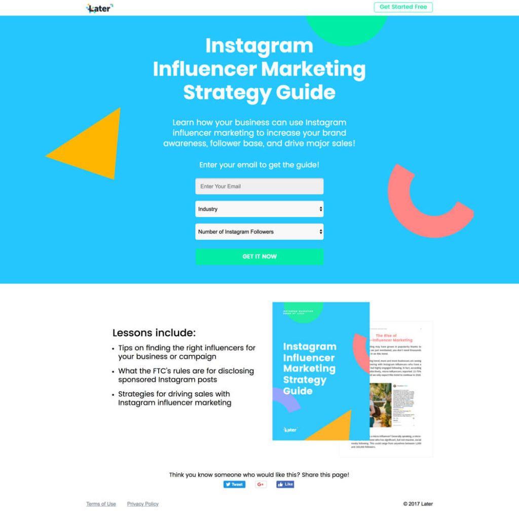
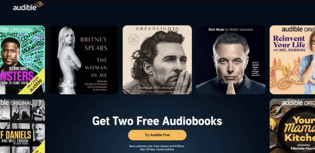
Product Promotion: Businesses can use landing pages to spotlight new or featured products with a direct call to action to purchase. They provide detailed information about the product’s benefits and features to entice potential buyers.
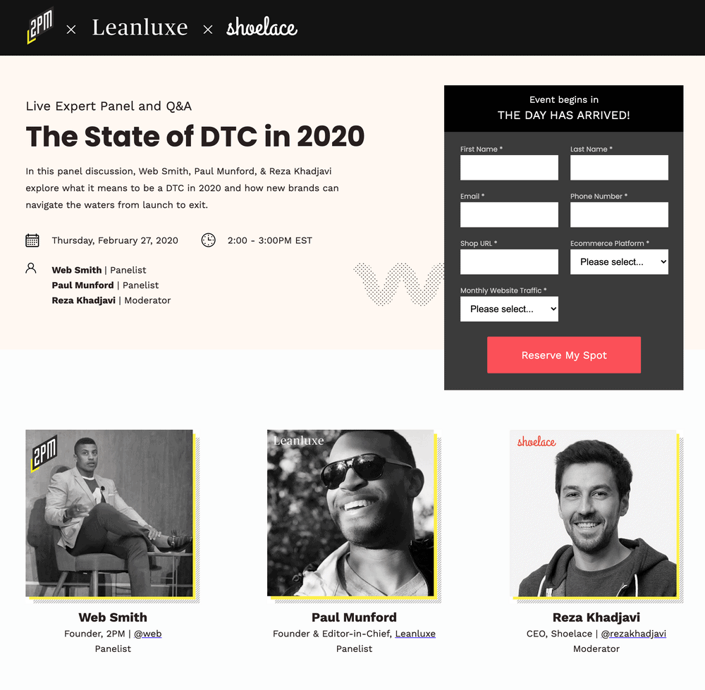
Event Registration: Landing pages can facilitate event sign-ups by providing all the necessary information and a simple registration form. They make it easy for visitors to register for events like webinars, conferences, or workshops.
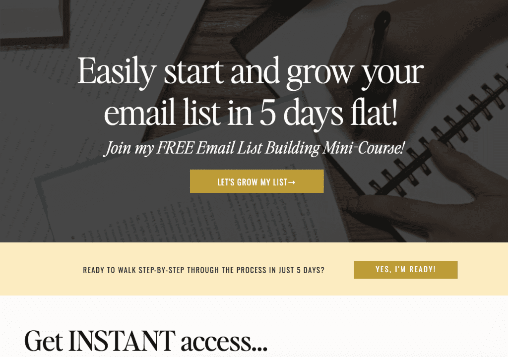
Email List Building: These pages are highly effective in growing email lists by offering lead magnets or valuable content in exchange for email subscriptions.
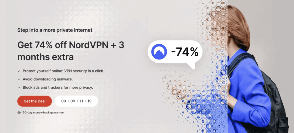
Special Offers and Discounts: Landing pages can promote limited-time offers, encouraging quick action from visitors. They often highlight special discounts or promotions to drive conversions.
Best Practices for Creating Effective Landing Pages
Clear Call to Action (CTA)
A strong and effective call to action is essential for guiding visitors toward the desired action. The CTA should be concise and action-oriented.
Use contrasting colours to make the CTA button stand out and phrases such as “Get Started,” “Sign Up Now,” or “Shop Now” to prompt action.
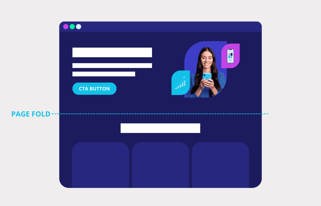
Pro tip: Keep your CTA above the fold. This means you should position it somewhere users don’t have to scroll down to see it. The call to action button should be one of the first things people see when they enter your landing page.
Write Compelling Copy
Don’t beat around the bush — your landing page copy should be clear and straightforward. It should grab attention and immediately communicate the unique selling proposition (USP) of your product or service.
The copy should resonate with the target audience, emphasizing the benefits of your offering. Often, businesses focus on their product’s features instead of the benefits it provides to their customers.
As an example, imagine you run a bed & breakfast creating a landing page to promote your newest rooms available. There, your guests will find a memory foam pillow, a high-quality mattress with 300-count Egyptian cotton sheets.
Instead of saying…
Bedrooms with high-quality bedding and mattresses
You can say…
The perfect place for you to truly relax
High-quality Visuals
When choosing images or videos for a landing page, go with high-quality ones that align with your brand and product — this is especially important if you have a non-tangible product or a service.
Images will help your audience create a connection with what you have to offer. Plus, they can significantly impact conversion rates.
Avoid using generic stock images. Instead, opt for authentic visuals that feature your actual product or team. A strong hero shot is key to capturing attention and setting the stage for your message. Ideally, images should not be heavier than 1 MB, so it doesn’t take too long to load and damage the experience of website visitors.
Social Proof
Adding a social proof element to your page can help you convert visitors into customers or subscribers. These can include testimonials, customer reviews, trust badges, case study summaries, etc.
Nowadays, it is rare to buy a product or hire a service without getting a second opinion, i.e. reading online reviews. Having the opinions of your previous or current clients in your page can help you build credibility about your product and services with your target audience. Plus, it assures visitors that your business is reliable.
Lead Capture Elements
A well-designed lead capture form is crucial for gathering visitor information. Keep the form fields minimal to reduce friction and encourage completion.
Offer incentives such as discounts, free trials, or exclusive content in exchange for filling out the form. Make sure the form is visually distinct, using different fonts or background colours.
Benefits Statement
When writing the highlights of your product or service, focus on the benefits it gives your audience, rather than just listing features. Sharing these benefits show your page visitors the value they will gain from your business. This is essential and to be done properly, you must have a good understanding of your audience. Plus, how your product or service can have a positive impact on their lives.
Use bullet points to make the list of benefits easily scannable. We recommend listing between three to seven benefits to maintain clarity and impact.
Examples of Effective Landing Pages
Netflix Landing Page (Lead Generation)
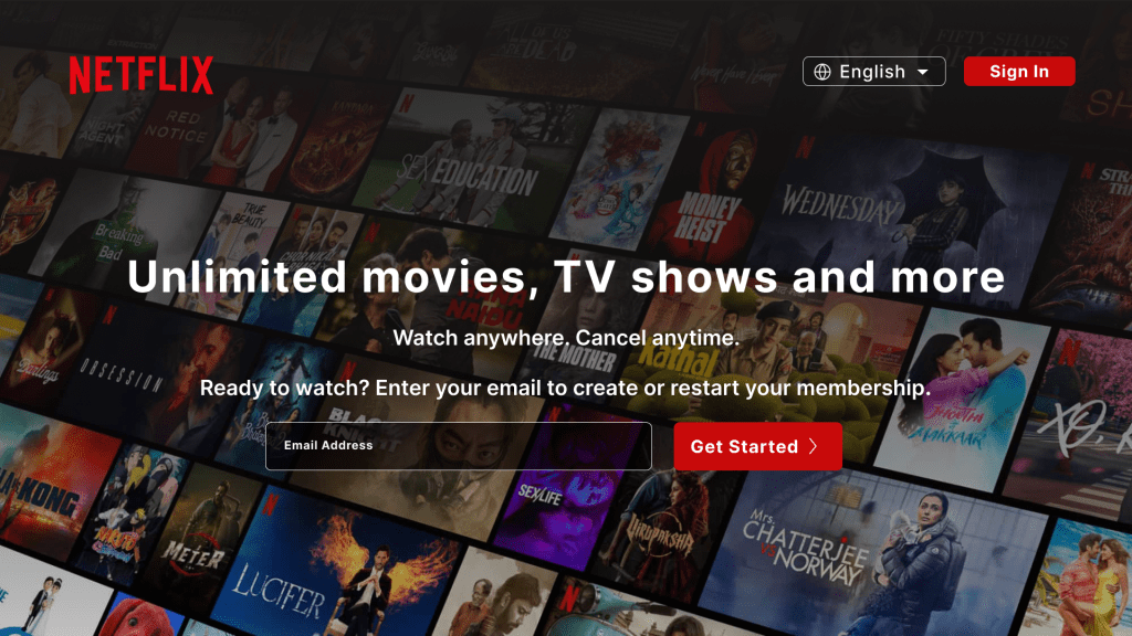
This landing page by Netflix is the perfect example of an effective lead generation page. It has a captivating headline that explains the service (“Unlimited movies, TV shows and more”), a clear action-focused CTA (“Get started”) in a contrasting button that matches the brand’s colours. Simple, yet very effective.
The page does not include a list of benefits, testimonials from past clients or other elements. Because Netflix is a worldwide known company and most people who find this page are probably already familiar with the product, know how it works and are on the final steps of making a purchase. Therefore, they don’t need a lot of information about it.
However, if you are a small business — at least, smaller than Netflix —, trying to reach a broader audience, or if you are selling high-ticket products or services, it is important to have those elements. A list of benefits can help the page visitors to understand how your product fits their lives, while the testimonials will help them decide if your product or your competitor’s is the best for them.
What you can learn from this example, even if you must add more elements to your page than what Netflix did, is that simpler is often better. It is better to have fewer high-quality information than to build a huge page that has a poor delivery.
Part-Time YouTube Academy (Click-Through)
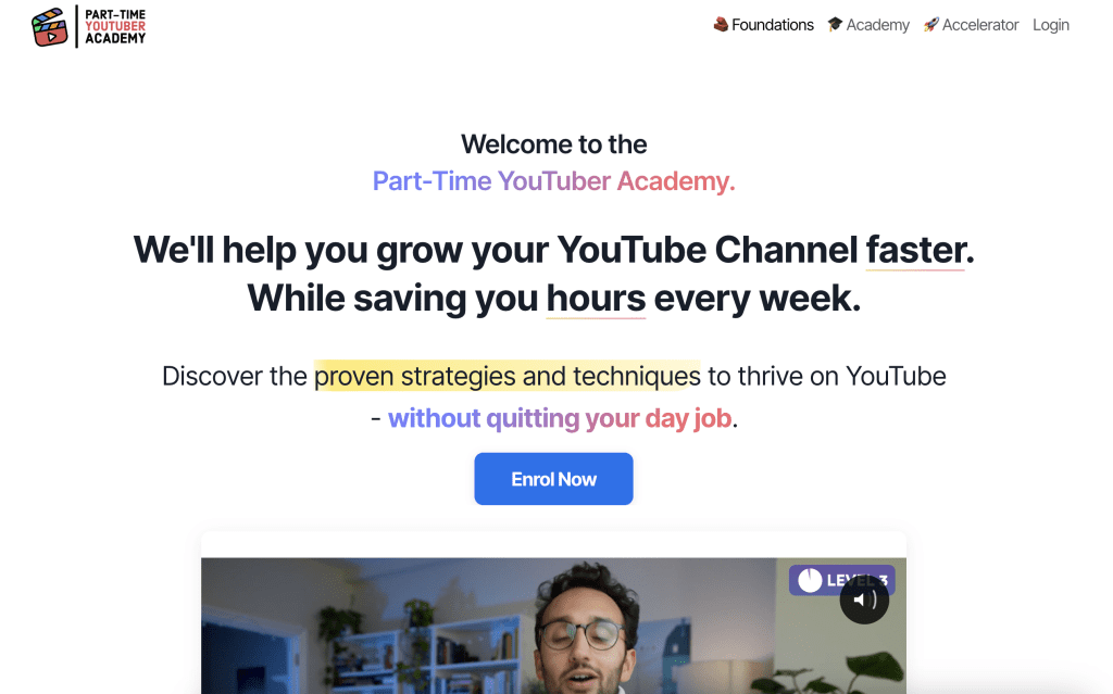
On this landing page, Ali Abdaal, a productivity and organization Content Creator, is selling his online course. The headline is focused on the benefits of the course (“We’ll help you grow your YouTube Channel faster”), and it also says that the course will “save hours every week”.
This second line shows that he understands the pain points and needs of his audience who wants to grow their YouTube Channel, but might not have a lot of time, or don’t want to spend a lot of time working on this.
He has a straight-forward CTA (“Enroll now”) that stands out. Also, he puts his most valuable resources forward: his videos. Since most people will arrive on this page because of his YouTube Channel, he added a video of himself talking about the course. Great strategy!
Measuring the Success of Landing Pages
As with any marketing channel, measuring the results and return on investment (ROI) of your landing page is crucial. Before creating your page, consider your business goals: How will this page help you reach them?
Set SMART goals for your landing pages: specific, measurable, attainable, realistic and time-bound. One of the key metrics for landing pages is the conversion rate.
What is the Conversion Rate?
It measures the percentage of visitors who complete the desired action on your page, such as signing up, purchasing, etc. To calculate your conversion rate divide the number of conversions by the total number of visitors and multiply by 100 to get the percentage.
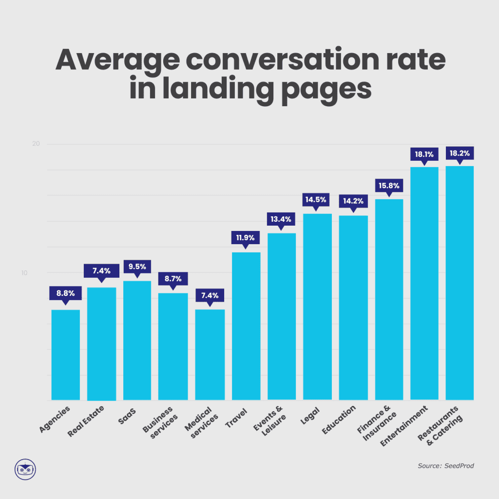
It is hard to determine an average conversion rate. According to SeedProd, the average conversion rate across industries is just under 6% (5.89%). However, Unbounce found that the average is around 9.7% — which means 1 out of 10 people who visit a landing page will take the expected action.
Compare your results to your industry benchmarks and make adjustments to your strategy.
How to measure your results?
There are several tools available to help study the performance of your landing pages. You can use Google Analytics to track your results and gain insights into visitor behaviour. Among other data, you can monitor the traffic source, time spent on the page, and click rate.
One of the best ways to see results from your landing page strategy is to test elements, and study the analytics to optimize landing pages, thus improving your chance to get better results.
Conclusion
Landing pages are powerful tools that can significantly impact your business’s success. By understanding what landing pages are, how they can be used, and the best practices for creating them, you can drive more conversions and achieve your marketing goals.
Whether you’re aiming to capture leads, promote products, or encourage event registrations, landing pages can be tailored to suit your specific objectives. Apply the strategies in this guide to create high-converting landing pages that resonate with your audience, consider their needs, present your product and service, and deliver tangible results for your business goals.
Sign up for the Cyberimpact newsletter to receive more valuable insights on digital marketing, landing page optimization, and effective strategies for growing your business. Stay updated with the latest tips and trends to keep your marketing efforts ahead of the curve!
