When it comes to email marketing, it often takes trial and error to come up with the most successful strategy. But there’s a way to avoid common email marketing design errors and subscriber hate. You can learn from the marketing experts and save your business time and money used on email marketing strategies that proved to fail.
Email marketing remains one of the most effective channels of communication. According to Statista, there are more than four billion people using emails across the globe. Putting your marketing email in front of just a tiny fraction of this figure means millions of current and prospective customers.
Email is also more affordable than other strategies, like paid social media advertising. It delivers the highest return on investment (ROI) of all marketing channels. According to Forbes, you can reach a $42 return for every dollar spent on email marketing.
To make sure you make the most of email marketing, you should get to know these common email mistakes and avoid them. Doing so will directly influence the success of your email marketing campaigns.
Keep reading to learn six email marketing design errors and other mistakes to avoid at all costs.
6 Email Marketing Design Errors and Other Mistakes to Avoid
- Using irrelevant or vague subject lines
- Poor visual design
- Sending too many emails
- Failing to optimize for mobile devices
- Neglecting the call-to-action (CTA)
- Ignoring email security
1. Using irrelevant or vague subject lines
Each of your subscribers gets tons of emails a day. If you use irrelevant or vague subject lines, your email might not get noticed or may just simply be ignored.
If you want people to open your emails, you should stick to the following rules when writing your subject lines.
Think about what value your email provides for its recipients. Tell people straight away what they will gain from opening your email. Keep it short, clear, and to the point.
Here’s a good subject line from Strava. It ticks most of the boxes. Plus, it’s intriguing and offers a special deal.
BREAKING: Save 25% on a subscription ?
People also like personalized content. Open rates increase by a whopping 50% when subject lines are personalized. So you should also personalize your subject line and address the user by name.
Here’s an example of a personalized subject line from Rebecca Page, a sewing enthusiast.
Emilia, prep your sewing machine!
Experiment with your subject lines. Then check the open rates so you’ll know which one to use in subsequent campaigns. It follows, of course, that you also need to make sure your emails reach your intended recipients. How else will they read your subject lines in the first place? So, make sure you verify the email addresses people give you. Many email finder tools have a verification feature you can use for this.
2. Poor visual design
Sending poorly designed emails is another email marketing design error you want to avoid.
Effective email visual design makes readers more compelled to read and take action. A visually striking email will hook your readers.
Small details can create a powerful reading experience. Readers are more likely to connect with emails that elicit emotions. So, photos, images, and gifs will work great for that purpose. You can also create an emotional response using specific colour palettes.
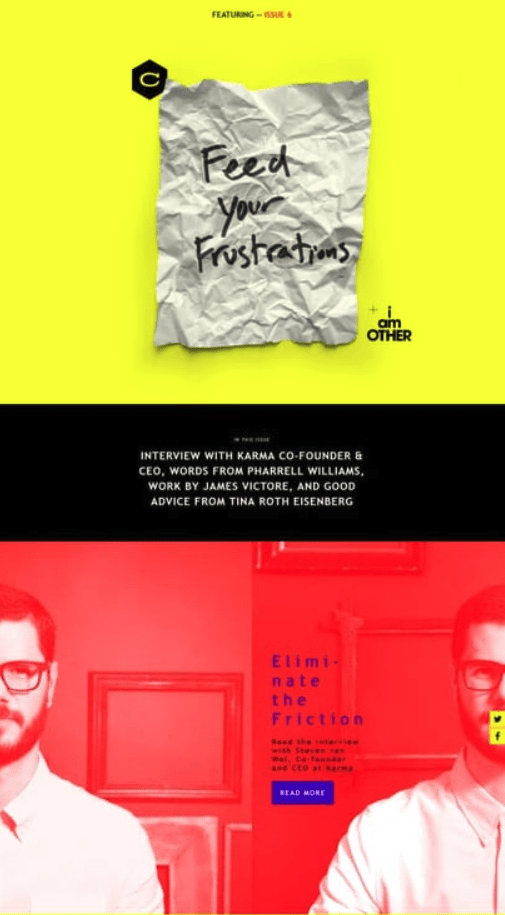
Here’s an example of a catchy email design from Collaborative Fund. The use of yellow and red brings a sense of energy and power.
While the design and colour scheme of your email may change for different occasions and purposes, some elements such as your brand logos, headers, and footers should remain unchanged across emails. Those email elements help your readers recognize your email messages and associate them with your brand and brand personality.
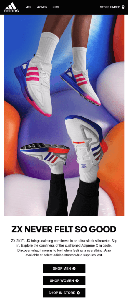
That’s what Adidas does in its newsletters. The company leaves its logos, brand colours, and top menu unchanged in its emails.
Make sure you include in your email your contact details, too. You want your subscribers to reach you easily, after all.
3. Sending too many emails
Sending too many emails in a week can annoy even the most loyal users. This mistake can result in readers unsubscribing.
If you’re not sure how frequently you should be sending your emails, you can always ask your subscribers. Use social media like Instagram, Facebook, or Twitter to ask the question. Or you can send an email with a poll or a survey. Check out this example:
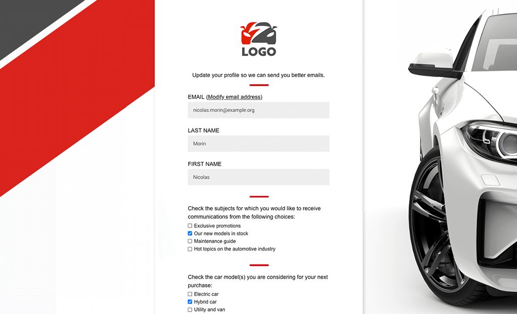
Note that the email also asks the types of content the subscriber would like to receive.
The next step is to automate the process of sending out emails at regular intervals. Email automation helps marketers with repetitive tasks. With reliable email software, you can set up workflows to send subscribers email messages based on the actions they perform. This way your email gets sent on the desired day and time, even if the marketer is on vacation or sick.
On the downside, sometimes, the automation software might place one subscriber on too many automated email flows. Your welcome email, newsletter email, celebrating subscriber birthday email, plus a thematic email, like Christmas, or Valentine’s Day email may all fall on the same week. So, be careful with that. This may annoy your subscribers.
Just start with a couple of workflows and add more as you get confident with email automation. Map out the whole workflow ecosystem to eliminate unnecessary emails, especially those that cause too much overlap. Also, review your send history and open reports to decide the best sending times.
4. Failing to optimize for mobile devices
Not optimizing for mobile is a serious mistake that can cost you potential customers. Around 75% of Gmail users check their inboxes on mobile devices.
So, make sure you’re using mobile-optimized email templates. This ensures your email is rendered properly no matter the device your subscribers use to read it.
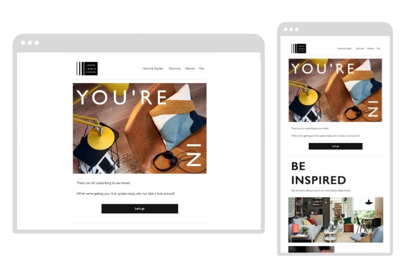
Other tips include optimizing the white space of your email. You should leave an appropriate amount of room between design elements to improve readability. This way the subscribers who open your email on a smaller screen will not see a cluttered email.
Here’s how Zara does it:

Too many images or gifs in an email is something your subscribers will hate, too. Those elements slow down the process of loading.
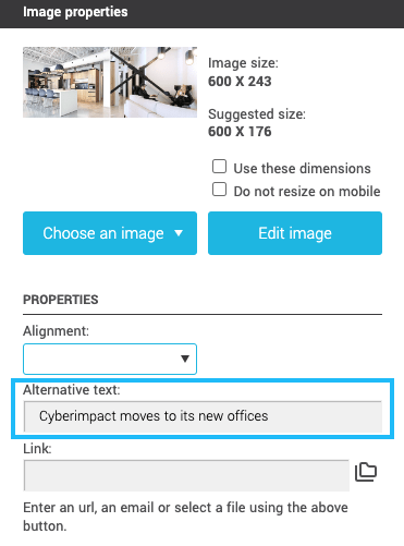
Just resize your images and keep them below 1,000 pixels wide. Write alternative text for each image, too. At least if the image fails to load, the reader will see the alt text and will know what the picture is about.
5. Neglecting the call-to-action (CTA)
Disregarding CTA buttons in your message design is another email marketing design error you should avoid. If CTAs are hidden, your recipients can fail to take your desired action. Your CTAs should be prominent to recipients who skim emails as well.
So, make sure readers can find and click your CTA easily. It’s best to put it in the upper fold of your email, like in this example from Harry’s:
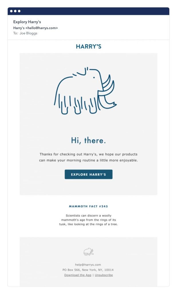
The CTA must stand out from the rest of the background, too.
Avoid including too many CTAs as well, as this can lead to confusion and result in readers feeling overwhelmed by too many options. This phenomenon is known as “choice overload.” By limiting the number of CTAs and making them prominent and clear, you can effectively guide your recipients towards taking any desired action, for instance, selling digital products.
6. Ignoring email privacy
When running email campaigns as part of your digital marketing strategy, you must follow the data privacy laws that apply to your business and location. Failing to do this could result in serious penalties and damage to your brand reputation.
Buying email lists, for instance, is a no-no. When you buy email lists, you disregard the General Data Protection Regulation. This emphasizes the importance of a subscriber opting in to receive your emails in the first place. If your recipients live in Europe, they’re covered by GDPR.
You should also give recipients a way to unsubscribe from your email marketing list. This is a must under the US’ CAN-SPAM Act. The GDPR also addresses consent in Article 7 when it said that “it shall be easy to withdraw as to give consent.”
You can easily include an unsubscribe link in your emails. Here’s an example from Wix:
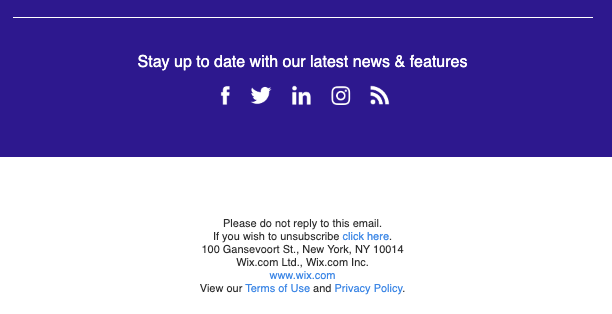
The email footer contains the unsubscribe link.Your email list should be composed only of people who are interested in your product or services. If you insist on sending emails to people who don’t want your emails, you won’t just violate existing laws. You’ll also earn minus points from potential customers, who will only end up marking your emails as spam. This can affect your sender reputation. With a negative sender reputation, email service providers may block your emails from reaching recipients.
In Closing
Email marketing design errors and other mistakes can cost you potential business. By avoiding these, you maximize your email marketing efforts.
You learned the things you need to avoid in your email marketing campaigns:
Avoid using irrelevant or vague subject lines and poor visual designs. When designing your email, make sure you make your CTAs prominent. Also, don’t send too many emails. Make sure you optimize for mobile to suit different subscribers’ device preferences. As a final tip, don’t ignore the importance of email privacy.
If you follow these tips, you’ll keep your subscribers happy. Your business will reap rewards, too.

About the author:
David Campbell is a digital marketing specialist at Ramp Ventures. He helps manage the content marketing team at Right Inbox. When he’s not working, he enjoys traveling and trying to learn Spanish.
